
Share On Social!
Research shows that the conditions in which we are born, grow, live, work, and age can have a big impact on our health.
Health data tools, like Salud America!’s Report Card, can help everyone from elected leaders to everyday Americans assess local health data, compare data to other places, and determine how to address the differences that are driving health issues in their communities.

Now, Americans have access to another health data tool – the Congressional Health District Dashboard – thanks to the NYU Grossman School of Medicine and the Robert Wood Johnson Foundation (RWJF).
The dashboard provides all 435 US congressional districts (and DC) access to local health data that was previously unavailable at the congressional district level, nor was it compiled in a single location or easily available to the public.
Explore the health snapshot for your congressional district!
What’s Included in the New Health Dashboard?
Overseen and regularly updated by a team of public health experts, the dashboard presents health data to users through interactive maps, tables, and charts.
The dashboard includes data on 36 key measures of health that affect people’s healthcare, communities, and workplaces, such as deaths from cardiovascular disease and breast cancer, housing affordability, and access to nutritious foods, according to a press release.
Users can compare this health data to state and national averages and among different backgrounds. 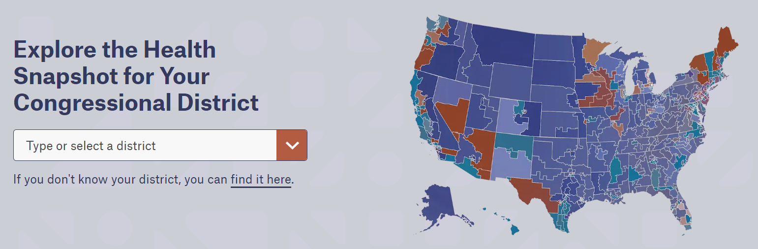
What Does the Health Dashboard Say About Health Differences?
The dashboard is already making waves in unveiling health issues across the nation.
For example, people living in congressional districts in the 11 states that have not expanded Medicaid coverage under the Affordable Care Act are twice as likely to be uninsured compared to those in states with expanded Medicaid coverage, according to a press release.
The dashboard also indicates that residents of congressional districts in Arkansas (8.3% Latino), Louisiana (5.6% Latino), Oklahoma (11.7% Latino), and Texas (40.2% Latino) on average are almost 3.5 times more likely to be uninsured than those in congressional districts in New England.
Additionally, on average, Latinos have the highest rates of uninsurance in most congressional districts across the country, according to a press release.
Explore the health snapshot for your congressional district!
The Importance of the Health Dashboard
Given the dashboard’s ability to provide geographic and background differences in health across US congressional districts, it could be a game-changer for developing evidence-based health policies.
Congress members can use the dashboard to identify emerging health and economic concerns, prioritize issues for policy action, establish health and socioeconomic goals, and develop prevention-focused programs.
“The Congressional District Health Dashboard will help fill a critical need for timely, rigorous, and actionable data that can inform evidence-based policymaking,” Dr. Marc Gourevitch, chair of the Department of Population Health at NYU Langone Health and the initiative’s principal architect, said in a press release.
“Now, policymakers, health leaders and patient supporters, and others can drill down to their specific congressional districts to identify the opportunities and challenges affecting the health and wellbeing of all the people they serve, regardless of income, background, or zip code.”
Explore the health snapshot for your congressional district!
Addressing Persistent Health Differences
Tools such as the Congressional Health District Dashboard can help achieve health improvement for Latinos and all people.
“Our health shouldn’t be determined by our congressional district, but these data clearly show how far we have to go to address persistent [differences] across the country. Regardless of who they are or where they live, all people in the United States deserve the opportunity to thrive,” Dr. Giridhar Mallya, senior policy officer at RWJF, said in a press release.
You can also select your county and get a Health Report Card by Salud America! at UT Health San Antonio.
In your report card, you will see maps, data, and gauges to compare public health issues to the rest of your state and nation.
You can email your Health Report Card to local leaders, including Congress members, to stimulate community change.
Use the data in your materials or share on social media to raise awareness about health difference issues in your area.
Explore More:
HealthBy The Numbers
1
out of 10
Pedestrians survive when hit by a car at 40 MPH

… [Trackback]
[…] Read More: salud-america.org/dr-francisco-g-cigarroa-the-first-latino-chancellor-of-the-university-of-texas-system/ […]