Share On Social!
Where we live plays a big role in how long we live.
That’s why racial and economic segregation are so harmful. Unequitable distribution of investment and services results in poor social and health outcomes for some.
Tonika Johnson saw this in real time as a teen when she commuted from the less affluent South Side Chicago neighborhood where she lived to the more affluent North Side neighborhood where she attended school.
“It’s like there was an invisible line dividing the city,” she said.
Johnson started the “Folded Map” project to explore neighborhood differences and discuss solutions.
In San Antonio, public health group CI:NOW were intrigued by Johnson’s “Folded Map.”
How could they use it as model to create their own data tool to help residents, advocates, and leaders explore how social inequities impact quality of life and longevity in Bexar County?
Johnson and the ‘Folded Map’ Neighborhood Project
Johnson knows that Chicago streets are on a grid system with streets running in straight lines either parallel or perpendicular to each other.
Madison Street acts as the dividing north-south dividing line, with addresses on the north side of each street matching the addresses on the south side.
For example, 500 N. State Street and 500 S. State Street.
Fold the map along Madison Street, and like addresses fall on top of each other.
As Johnson commuted from south to north, she saw how different life was for people living on either side of Madison Street.
She wanted to share. So, she took pictures.
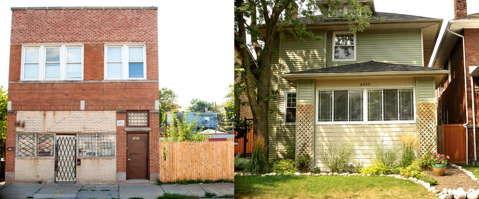
“She dubbed this new project Folded Map, and called her featured locations Address Pairs because when placed side by side, her images plainly revealed how run-down homes and businesses on the South Side were, compared to those with matching addresses on the thriving North Side,” according to Sarah Ashley of the Culture Trip.
She photographed the boarded-up home with overgrown weeds at 6330 S. Paulina, and she photographed the well-kept home with a manicured lawn at 6330 N. Paulina.
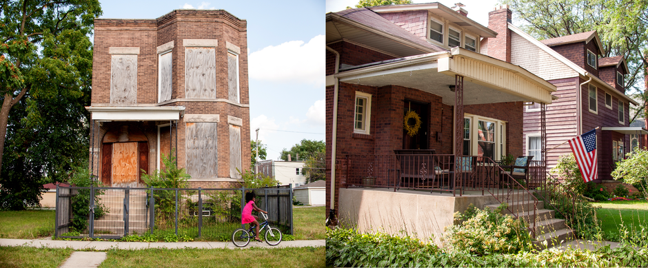
“Her work presents a clear picture of how differently the city’s communities are taken care of and how racial segregation still affects Chicago’s neighborhoods today.”
Then the project took on a new twist.
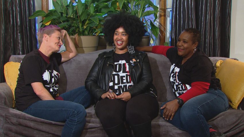
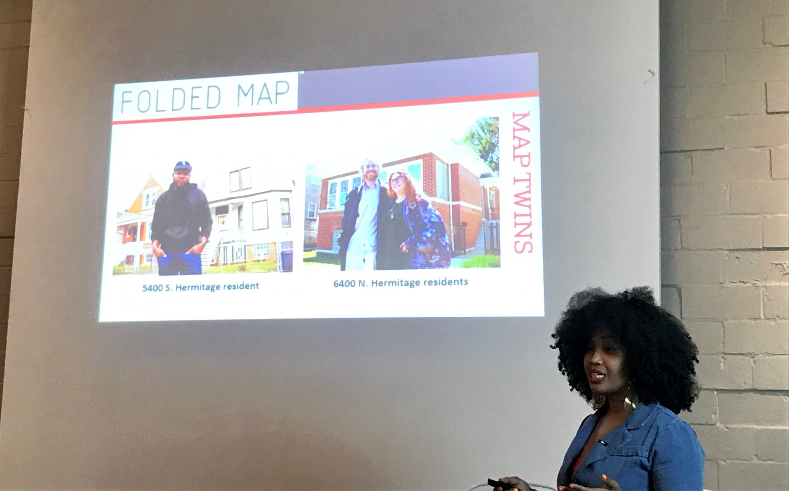
Johnson and the ‘Map Twin’ Neighbors
Johnson wanted the people living in the address pairs to meet.
She calls them “map twins.”
Johnson reached out to Nanette Tucker from the South Side and Wade Wilson on the North Side, explained they are “map twins” and asked if they would be interested in meeting.
Tucker and Wilson agreed.
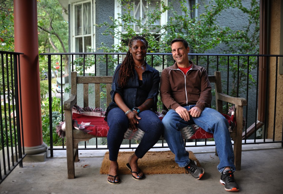
Johnson facilitated a meaningful conversation about segregation and differences in quality of schools, access to grocery stores, walkable streets, and other amenities.
“Sometimes it seems like there’s nothing you as an individual can do to change [segregation] to a significant degree, so when Tonika came along and introduced my wife and I to the project, we thought, ‘This is a small way to bridge that gap,’” said Wilson, according to Amal Ahmed with City Lab.
Johnson has introduced many more maps twins to each other, many of whom remain friends.
Johnson also encourages all North Siders to visit the South Side and all South Siders to visit the North Side. She speaks at events to challenge Chicago residents to explore for themselves the differences in investment.
“The success of Folded Map has turned Johnson into a kind of ambassador to our divided city,” wrote Mary Schmich in the Chicago Tribune. “She tries to connect people by helping them learn about the ‘other’ side of town, beyond the shorthand of the news, and to help them understand how history and policies shape people and places.”
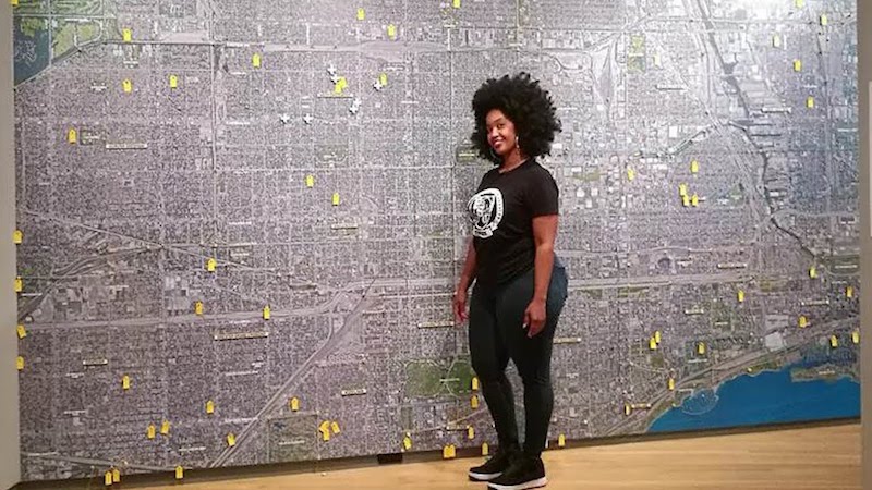
Folded Map is on display at the Loyola University Museum of Art.
“The project invites audiences to open a dialogue and question how we are all socially impacted by racial and institutional conditions that segregate the city,” Johnson said.
How could this work in San Antonio, which doesn’t have map twins?
Researchers Seek to Address Social, Health Injustices in San Antonio
Unlike Chicago, San Antonio is not laid out in a grid and does not have one distinct dividing line.
But like Chicago, the city is plagued by racial and economic segregation and disparities in health and wealth, including a 19-year gap in life expectancy between certain neighborhoods.
Researchers at CI:NOW, based at the UT Health Houston School of Public Health in San Antnio, seek data-driven solutions to these inequities.
The team learned of Johnson’s “Folded Map” project.
Like Johnson, CI:NOW wanted to use data visualization to start a conversation about how urban environments impact social and health outcomes. They wanted to unite residents to better understand and ultimately change neighborhood conditions, laws, and systems to make it easier to thrive.
They found a grant to do just that.
Creating a Data Visualization Tool to Explore Life Expectancy in San Antonio
CI:NOW applied for one of 10 grant projects supported by the Robert Wood Johnson Foundation and the Urban Institute to use United States Small-Area Life Expectancy Project (USALEEP) data to initiate conversations that lead to action to narrow gaps in life expectancy.
The grants aim to:
- Empower local organizations across the country to use neighborhood-level data to shed light on geographic disparities in health outcomes and life expectancy in their community;
- Encouragecommunities to leverage this data to engage with local community members and policymakers to generate data-driven local health narratives that initiate conversations that lead to action; and
- Elevatereplicable strategies and models that centrally use these data by sharing the grantee’s data-driven practices and solutions to show how others can put local data to work for their communities.
![]() CI:NOW submitted a project call “Somos Neighbors.”
CI:NOW submitted a project call “Somos Neighbors.”
Instead of “map twins” like in Chicago, their proposal would use USALEEP data to “match” neighborhoods and compare and contrast quality of life indicators.
They wanted to create a tool that could pinpoint geographic disparities in health outcomes and life expectancy while also initiating community conversations that lead to action.
Moreover, per the grant requirements, they were excited to create an open source tool that would available to other communities to replicate.
They were one of 10 organizations awarded the Visualizing and Powering Healthy Lives grant.
The ‘Somos Neighbors’ Data Visualization Tool
CI:NOW developed the interactive Somos Neighbors tool in both English and Spanish.
You can enter your address or a landmark in your neighborhood, and the tool will “match” you with another neighborhood in the county.
Your match is determined by a score of variables that are similar between neighborhoods; a filter of neighborhoods within two miles; and filter of neighborhoods more than five difference in life expectancy.
The tool compares similarities and differences between multiple quality of life indicators, such as:
- Percent housing cost burden
- Median age
- Voter turnout
- Average vehicles per household
- Life Expectancy
- Carpool to work
- Percent in prison or jail
- No health insurance under 18 years old
- No health insurance Age 18 to 64
- Prevalence of hypertension among adults
- Prevalence of obesity among adults
“Income segregation, our large geographic size, and our car‐dependent economy don’t allow us many chances to learn about other neighborhoods or connect with our neighbors who live there,” said Laura McKieran, executive director of CI:Now, “So most members of our community aren’t really aware that our chances of living to see our grandchildren grow up vary so much depending on where we live.”
Using the ‘Somos Neighbors’ Tool for Action
CI:NOW isn’t only a good tool for data visualization.
Residents can post photos of their neighborhoods. The website connects people on ways to learn more about, speak up, and act on local issues.
Share this project with members in your community and start a conversation about how social, environmental and institutional conditions impact your day-to-day life, thus health and wellbeing.
You could even start a similar project where you live.
CI:Now will soon release a guide to help others create a similar tool in their own community with:
- information about the census tract matching algorithm and methods;
- indicator calculation and selection;
- website functionality and open-source tools; and
- approaches to outreach and encouraging local use of Somos Neighbors.
Learn more about the other nine Visualizing and Powering Healthy Lives grantees here.
For example, Richmond City Health District developed a data-driven project using USALEEP data to support Richmond Public Schools’ rezoning and magnetizing process. They will hold community sessions to strategize the rezoning/magnetizing process.
Additionally, Prevention Institute will use the USALEEP data to quantify the relationship between health outcomes and access to parks and green space at the census-tract level. They will establish a community advisory board of communities with limited access to parks and build resident’s power to convince eleted officials to prioritize park improvements in their neighborhoods.
Follow #CloseHealthGaps on Twitter and share your stories of using USALEEP data to advance health outcomes.
Explore More:
Healthy Families & SchoolsBy The Numbers
142
Percent
Expected rise in Latino cancer cases in coming years